Beginning the Process
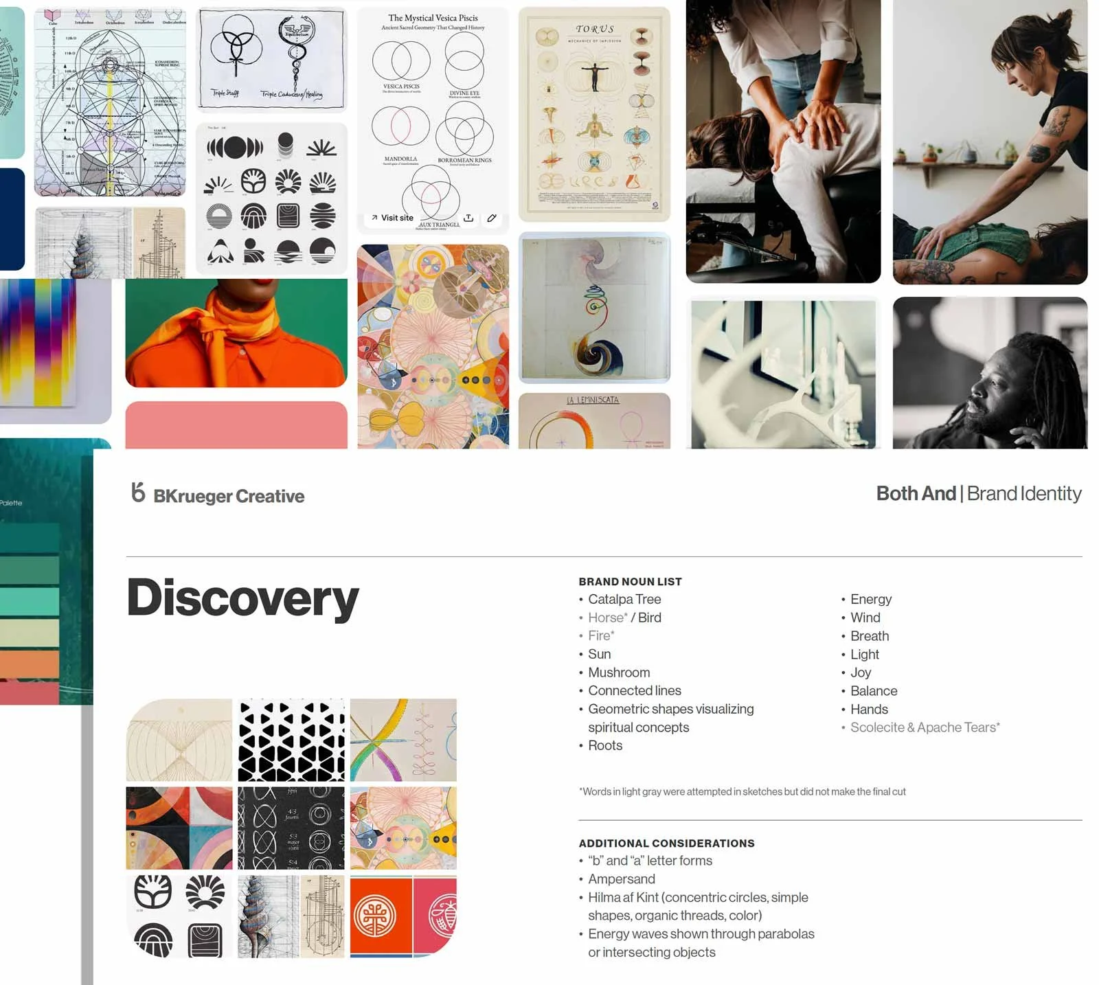
The journey to complete an identity for wellness brand Both/& started completely from scratch (including name). The process began with basic discovery, which helped align the brand to the vision of its founder. This led us to organically shape the start of an identity through carefully chosen word association, followed by visual inspiration.
Client
Both/&
Year
2025
Design and Direction
Ben Krueger
Initial Explorations
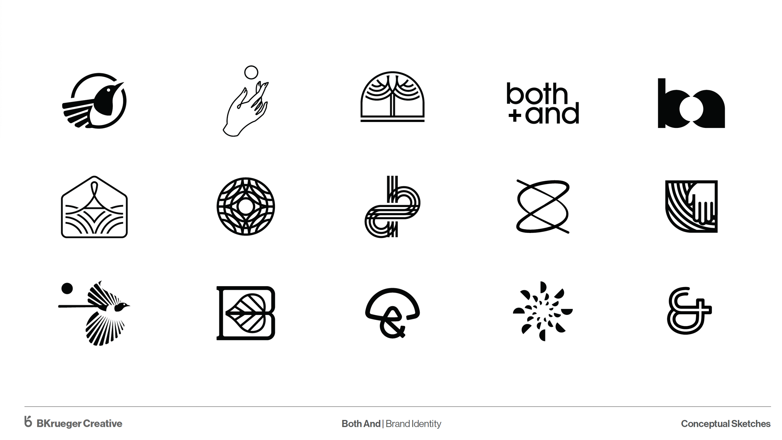
For initial explorations, the selected word choices and inspiration boards became a visual and verbal brief for rough ideas. 15 unique explorations are given to be talked about at their most basic levels. No color or complete lockups here—we want all the dialogue to be about the idea, not the details.
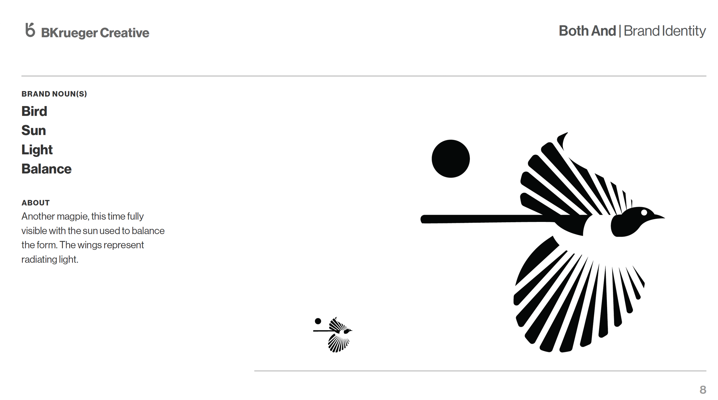
Choosing the Idea
Each idea is presented with an explanation of how it aligns with our previous conversations. We aligned on continuing with the second magpie mark shown below. The magpie is a symbol of duality, which matches the spiritual foundation of Both/&.
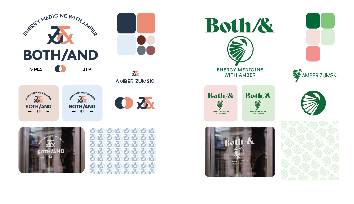
Color and System
One last variant is given to contrast the magpie mark—this time, both ideas appear accompanied by a brand system that includes color, pattern, and logo lockup with typography.
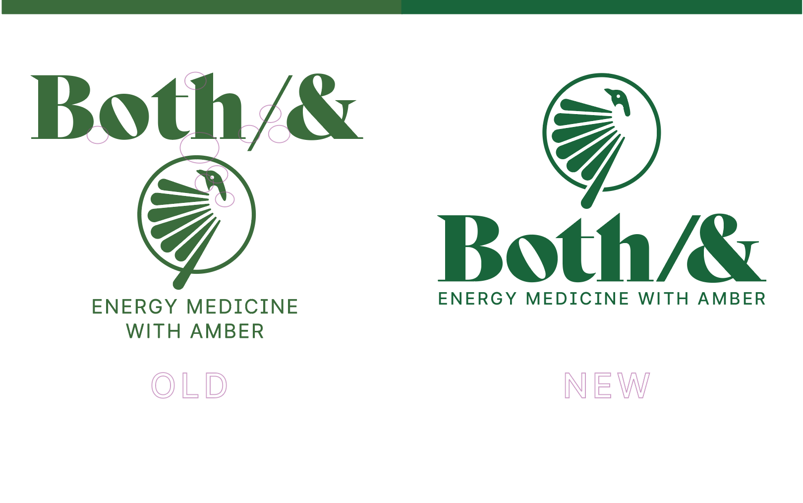
Final Adjustments
Careful consideration is given to negative space, kerning, and the relationships of elements, allowing the logo to make a stronger presence.
Both/&
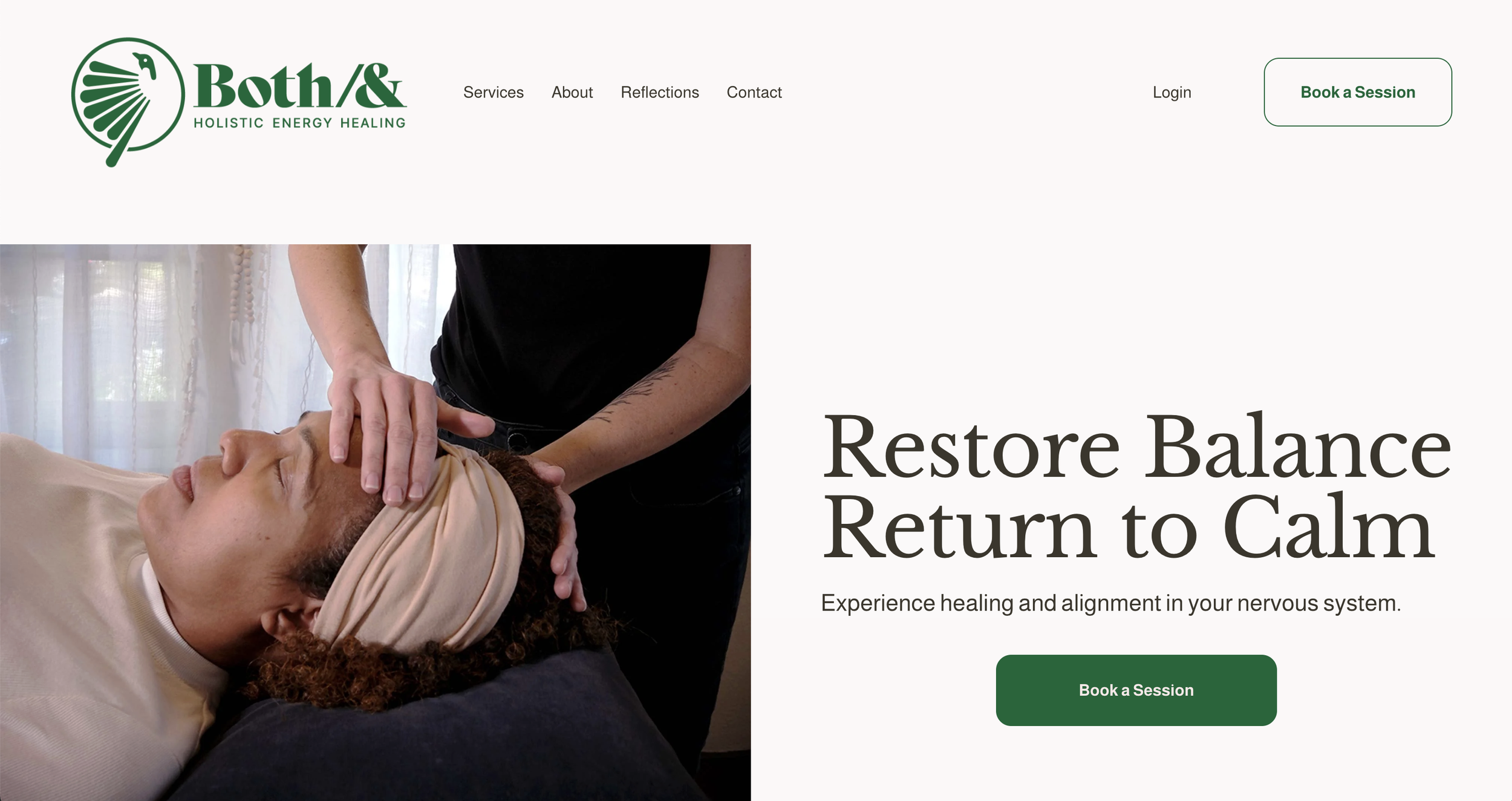
With the finished mark in place and collaboration to complete initial photoshoots, the work quickly moved to developing an online presence.